Embed Control can load layouts that have been generated in tcMenu Designer. These layouts provide more control over the mobile layout than what is possible using the Auto UI. Either the user-centric or tcMenu Designer based UI can load forms, but only tcMenu Designer can create them.
How does Embed Control show menu items?
A form layout is nothing more than a grid of drawing instructions, and you can select the number of columns in the grid, along with the layout name and a few common options. Let's dig into how these grids are created, and the options for loading these grids into Embed Control. It is assumed at this point, that you are fairly familiar with both TcMenu and Embed Control.
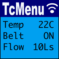
If we look at the TagVal protocol; which Embed Control uses to communicate with a board, the connection starts with a bootstrap, this bootstrap sends the details of each menu item to the Embed Control UI. Once the UI receives these items it has two options, either to present a form (discussed next), or to generate an Auto UI by laying out items one per row, in the order they arrived, using some sensible defaults.
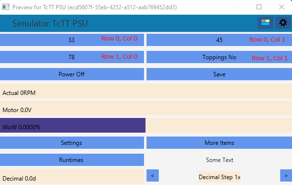
If a form is loaded instead of using the AutoUI, it will populate the grid using the details in the form instead. A grid is made up of rows (vertically) and columns (horizontally), and at each position there is a cell. Each cell can either be empty, contain a menu item definition, or static text that should be printed there. Let's now see an example of such a grid.
How to create or edit forms
To edit a form, we must first load the menu project into tcMenu Designer and select "Show Preview" from the "Embed Control" menu. Once you do this, a preview window that shows your menu layout will appear, and to the top right will have a form management menu button as shown below. Clicking the form management button results in a menu similar to below.
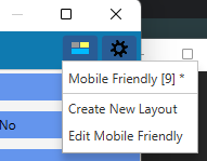
This menu serves two purposes, firstly to select a particular layout for display, and also to either create a new form, or to edit the existing one. The editing options are at the bottom.
Editing a custom form
Once we select a form for editing (either create new form, or edit) it will come up in the following editor.
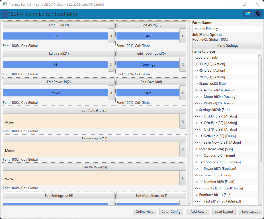
Looking at the form editor, in the right hand panel we can see the form name is editable, a button provides access to the settings for the current menu, clicking on that brings up the following dialog:
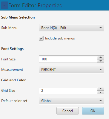
Forms can be per sub-menu, or for the whole menu at once (recursively showing all levels), you can choose between either option, and even pick and mix, with some levels using Auto-UI. To change the sub menu simply choose the sub menu you want a form for, and tick or un-tick the recursive option underneath.
You can set the font information and also the size of the grid and default color scheme as well. These are then saved at the top level.
Placing items into the grid
Below the settings button is the "Items To be Placed" list, a list of all items that can be placed into a cell is presented. On the left is the layout grid we discussed above, each position in the grid is represented with an editable grid slot shown below:
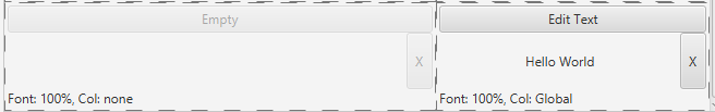
When an item is empty, such as the one on the left, you can drag from the "items to place" list into the cell. Doing so does the same as the AutoUI and populates with sensible defaults. However, you can now click the edit button at the top of the cell and change the value. Clicking the "X" button on the right clears anything in the cell. At the bottom of the "items to place" list are two extra options, one to create a cell with static text, and one that puts spacing into a cell.
Editing the contents of a cell
Once you've dragged a menu item into a cell, clicking the edit button brings up the following:
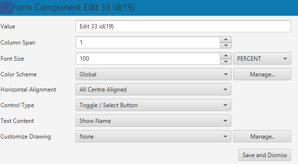
In the above form you can change how many columns the component spans, the font size, assign it a color scheme, set the presentation, alignment and type of control to be used. We'll come to customized drawing later. Once finished press the save button to store the new value and dismiss the editor. Note that in the control type field, only items that can be used with this menu item will be displayed.
For static text fields, the same component editor is shown, but only color, font and alignment are shown.
To add / edit color schemes, press the "Manage" button next to the color scheme, in the next section we'll discuss the color scheme editor.
You can add / edit customizable drawing entries by clicking the "Manage" button next to the custom drawing drop down. This concept and editor is described further down the page.
Different types of controls (in cell editor)
There are many different control types that you can use in a form, only applicable ones are in the control type list. The most common ones are:
- Can't render - do not render
- Text Editor - can be used for nearly all types, will present the menu item as text, and if not read only, upon editing, it will bring up a validated text box.
- Button/Toggle - can be used for actionable items, for example SubMenu, ActionItem, BooleanItem. If chosen for a sub menu it will navigate to that menu.
- Horizontal Range - draws a numeric item somewhat like a percentage bar, editable.
- Circular/VU Meter - draws a numeric item as either a circular or vu style meter.
- Up/Down editor - allows for incrementing and decrementing of a value based menu item such as Analog, Scroll, or Enum Item
Editing Color Schemes
You can create and edit all color schemes from the form editor. The color scheme editor appears after clicking manage.
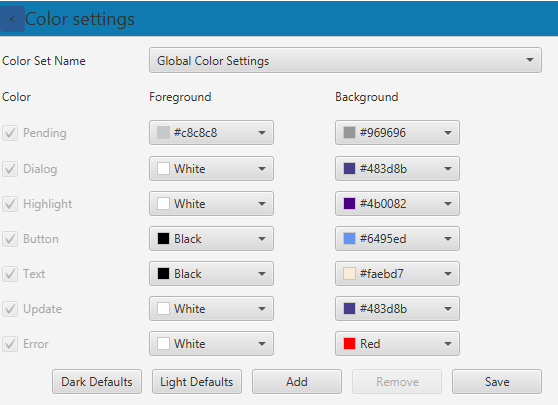
Here you can edit color schemes, and even create new schemes. You select a color set at the top and then that color set is editable.
To add a new scheme simply press the "add" button and choose a suitable name. You do not need to define every color definition (except at global level), you can choose to override just a couple of colors in a new color set. This is controlled by the checkbox on the left of the color name. Once you're done editing, press Save and the new value will be available in the cell component editor.
Note: Embed Control has a global color scheme, it is user defined, so configuring additional color schemes could well produce variable results. If you heavily customize color schemes, it may be better not to rely on the global scheme at all.
Create your own Customizable Drawing entries
It is sometimes desirable to have ranges of values that are drawn differently, for example an audio line input in decibel scale may show orange above 0dB and red above +3dB.
| Value | Fg | Bg |
|---|---|---|
| -20dB to 0dB | Green | White |
| 0dB to +3dB | Orange | White |
| +3dB to max | Red | White |
Numeric ranges can be used with float item, analog items, scroll and enum items.
Sometimes we may want to handle certain string values differently, again we can choose string color ranges for this, and then if the string value matches, it uses the override color. Lastly, boolean true/false customization is also possible.
To edit custom drawing, simply click "Manage" to the right of the combo box in the component editor.
Importing, exporting and embedding forms
From 4.2.2 onwards, forms that you create are stored with the project, when you create the first Embed Control form, then a sub-directory called forms will be created in the project. A link to this form will be created in the database, so that it can be used just as you would any imported form. If you remove, or otherwise the move the directory the form manager will automatically remove the link to it. If it has moved to another location, simply open the preview window from the new location to re-import.
For external forms (IE ones you're not going to edit), you can load and save forms from the "Embed Control -> Form Manager" window. This allows you to both import and export forms to and from XML. Forms are stored in an internal database, this is located in the ~/.tcmenu directory. Make sure you back these forms up every now and again.
It is also possible to embed the forms into your embedded app, consult the embedded menu code generator documentation for more information on how to do this.
These may be of interest
- Similar - Write XML with GroovyBuilder
- Similar - Wrapping JFreeChart as a Groovy builder
- Similar - Reading XML in groovy using XmlParser
- Similar - Generate an ATOM feed with GroovyBuilder
- Similar - Groovychart Bar chart with fixed colour

Want to let us know about something?
- If this is a library documentation page, raise a PR on the documentation site.
- Open a discussion on the Community channels
- Contact us for problems or improvements on the main site.
Table of contents
- How does Embed Control show menu items?
- How to create or edit forms
- Editing a custom form
- Placing items into the grid
- Editing the contents of a cell
- Different types of controls (in cell editor)
- Editing Color Schemes
- Create your own Customizable Drawing entries
- Importing, exporting and embedding forms
Supporting us
We maintain several popular embedded projects and work hard to make them even better. If you're looking for commercial services, please do consider us.
Alternatively, you can buy us a coffee to say thanks.
Sharing links
Learn about TcMenu
We build and maintain an embedded menu designer and framework that works on many platforms.